|
Data Police episode
537: The google covid19 mobility report and its usage |
|
|
|
|
|
|
|
|
This is a component
of the ad hoc covid19 data project connected to the FUFF platform (fuff.org) |
|
|
http://fuff.org/data/cr0.html |
|
|
|
|
|
There is a temporary
google sheet version of this document. You can add ressources that you find
valuable.
Please note that the current version of this google sheet version might not
have been reviewed yet. |
|
| google
source |
https://www.google.com/covid19/mobility/ |
|
|
|
|
| 1 |
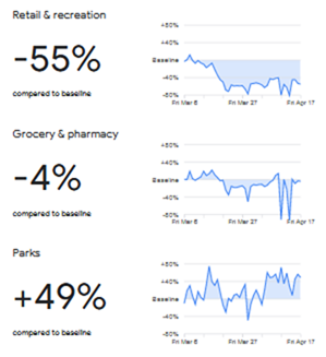
During the covid19
crisis google has decided to publish so called 'community mobility reports',
in a form that google calls 'aggregated, anonymized insights'. Here is the
example for Germany. |
|
|
|
|
|
|
|
|
|
|
|
|
|
|
|
|
|
|
|
|
|
|
|
|
|
|
|
|
|
|
|
|
|
|
|
|
|
|
|
|
|
|
| 2 |
I see wide use made
of these published reports/charts to make sense of the change of behaviour
during the covid19 crisis. |
|
|
|
|
| 3 |
However, it is also a
good example of the pitfalls and frivolities that come with a use of data
like this and in general.
Let me explain some. |
|
|
|
|
| 4 |
A possible (and
likely) mistake: confidence
This is big!
Because the data (or better the visualisation) looks like what you expected
(or what you wanted to find) you 'approve' it for yourself and your further
use of it. This is a lot easier and more inviting than facing the excercise
of scrutinizing and probably finding out that you have to put multiple
asterisks around the interpretation. |
|
|
|
|
| 5 |
There are several
consequences connected to this: among others, the neglect of hidden
connections, another is the inheritance of trust to later details where it is
not appropriate. |
|
|
|
|
| 6 |
Let's take the
example of Germany that we already saw in the screenshot above. |
|
|
|
|
|
|
|
|
|
|
|
|
|
|
|
|
|
|
|
|
|
|
|
|
|
|
|
|
|
|
|
|
|
|
|
|
|
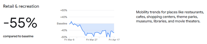
| 7 |
Ok, you say, this
makes sense. Self-isolation, closing downs and public orders make people
visit retail and recreation places much less frequently. |
|
|
|
|
| 8 |
It does make some
sense, but the value of -55% has to be thoroughly investigated. |
|
|
|
|
| 9 |
First of all we are
not talking about of an absolute value, but a percentage in relation to a
baseline value.
Have you read and understood what this baseline is? |
|
|
|
|
| 10 |
The baseline is
"the median value, for the corresponding day of the week, during the
5-week period Jan 3–Feb 6, 2020". So for a Monday it is the median value
of the five Mondays from January 6th to
February 3rd. The value therefore is the change from one of these 5
Mondays to the Monday we are looking at.
Please note: it is the median, not the average (It is actually better to
take the median here but it still has advantages and disatvantages) |
|
|
Google talks about
"visits and length of stay" but does not specify exactly what is
meant, minutes of stay or a mix of number of visits and length of stay. |
|
|
|
|
| 11 |
So we are not
precisely comparing the same situation here. There would have been a
different behaviour anyway in April compared to some January day and this
could vary a lot between countries, especially if you think more globally. So
comparing Spain and Germany for example is a big problem. But that is exactly
what you are tempted here to do because you want to compare harsher and
softer lockdowns for example. |
|
|
|
|
| 12 |
The next point is the
representativeness of data. First the data is limited to Android users only,
next it is only users who have opted in to the use of their location data.
This is not at all evenly distributed in society, so we definitively get a
skewed image. Again, there are big differences between countries. |
|
|
|
|
| 13 |
Now we come to the
aforementioned inheritance of confidence. The actual value of -55% might be
of little use, but the basic trend seems to make sense. At least for that
probably still quite large group of Android users who have opted in to their
location data usage. |
|
|
|
|
| 14 |
But what is the
development since March 20th? It seems to be quite stable, but with some up
and downs.
This is where our confidence tricks us once again: We assume that details
make sense because the big picture makes sense. |
|
|
|
|
| 15 |
Do you see the two
lows on April 10 and 13? These are strict holidays in Germany, shop opening
is prohibited among other things.
Of course you have a low peak there for shopping compared to a median
Friday/Monday in January. You might even have a peak in the other direction
for other non-prohibited recreational sites, that might actually have
recorded an increase in visitor numbers. |
|
|
|
|
| 16 |
Now, if you want to
detect holdidays (or other special days)in a country, this chart as it is,
will be helpful.
But if you want to draw conclusions about the general behaviour you will
have to eliminate and ignore those days entirely and only work with
comparable and consistent data. |
|
|
(Unless you want to
predict holiday behaviour for future holidays) |
|
|
|
|
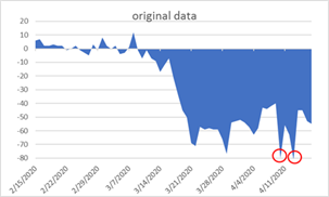
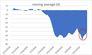
| 17 |
Often we attempt to
flatten those effects by using moving averages over several days.
However, that would not improve our case here. You only would stretch those
'irregular' values onto several days and might even be tempted to explain
that resulting new 'trend' to yourself, inventing something that is not
there.
Here are the charts for original data, moving average, and filtered data
(holiday data eliminated): |
|
|
|
|
|
|
|
|
|
|
|
|
|
|
|
|
|
|
|
|
|
|
|
|
|
|
|
|
|
|
|
|
|
|
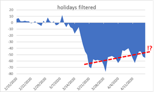
| 18 |
So now, with a
clearer picture, we are suddenly suggested an upwards trend in
retail/recreation visits! But be careful with conclusions, we would have to
consider context changes, including weather among others, in our conclusions.
Again we are tempted to believe it just as it is because it fits a narrative. |
|
|
|
|
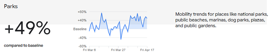
| 19 |
Now let's take a look
at 'parks'. Here, once again, inheritance of confidence can fool us. |
|
|
|
|
|
|
|
|
|
|
|
|
|
|
|
|
|
|
|
|
|
|
|
|
|
|
|
|
|
|
|
|
|
|
| 20 |
Perhaps we did not
pay attention to the info that the baseline was a January day. And maybe we
do not use weather data for comparison.
We could be tempted to say 'oh, yes, this shows people have more time to go
to parks' or 'oh they are not disciplined, the visits to parks is not less,
but even more than before'. |
|
|
|
|
| 21 |
This is a typical
process that I have often observed: People see data like this, have
confidence in it, and even when a detail is surprising, they look for
explanations and then get enthusiastic about an interpretation that is not
only monocausal, but totally uncertain. |
|
|
|
|
| 22 |
The use of parks etc.
in Germany is extremely seasonal, and comparing a 23° degree sunshine day in
April to a median 5° January day makes little sense, especially if you put it
in relation to other data that do the same but for indoor (and sometimes even
mandatory) activity such as work or shopping. (Being even inversely
connected)
And it is different from countries where seasonal changes in behaviour are
much less extreme or even not comparable at all. |
|
|
|
|
|
|
| 23 |
So we find ourselves
in a dilemma here: the value needs explanation, but any explanation is
speculation. |
|
|
|
|
| 24 |
The big, fat 49% on
the left is also very problematic. This is not an aggregated value, it is the
value for the last day of this chart. Especially if you have a value with
such a high volatility like the weather-dependent visit of parks and public
places in Germany, it is completely misleading. It is visualized as if it
were the quintessence. But it is rather a random number. |
|
|
|
|
| 25 |
And there is one last
thing that we may have overlooked in our enthusiasm: all data in the last
report at the time of this writing are... …already 9 days old. |
|
|
|
|
|
|
|
|
Did I miss anything? |
|
|
|
|
|
|
|
|
|
|
|
|
|