| This is a component of the ad hoc covid19
data project connected to the FUFF platform (fuff.org) |
|
|
|
|
|
|
|
|
|
|
|
|
|
|
|
|
|
|
|
|
|
|
|
|
|
|
| http://fuff.org/data/cr0.html |
|
| At
the bottom of this page are tabs. Click there for individual countries. |
|
| please
excuse the unformatted output. I will try to improve it. |
|
| important:
if you come back for updated versions, you have to refresh every single page!! sorry |
|
|
|
| This
document is an attempt to make sense of the available data and tackle
misunderstanding and misinterpretation that comes from unmoderated pure
data |
|
|
| - All the
available data for corona is flawed (that applies for most data we work with) |
|
| - states
report differently, states have individual problems aquiring the data, states
define things differently, test differently, and maybe even manipulate |
|
| - what
makes it even more difficult that there are phases which influence the
reporting quality of a particular country, so that even the numbers of a
single country can be inconsistent |
|
| - example:
we do know the number of 'officially confirmed cases', but we know that the
number of sick people is bigger. but how much bigger? |
|
| - example:
we do know that the number of actually infected people is much bigger because
not everybody is tested and a good number has no or few symptoms. but how
much bigger? |
|
| - example:
we do know that the number of fatalities is bigger, in some countries much
bigger than official numbers, because some contain only tested hospital
cases, some only tested, some add other numbers and some don't even know what
regional authorities include |
|
| - example:
we do know that past cases that had not been counted are added at some date
(all for that date) and from then on the data basis changes and is not
comparable to what was reported before that date |
|
| - example:
we do know that in most data that is collected in sources like ECDC and JHS,
it is not the data 'as happened on that date' but data that 'was published on
that date'. Means data for 1st of April is not the 1st of April data but
incomplete cases that were counted on several, different days before by
several local authorities and now published on 1st of April. |
| (the
sources do not claim else. Unfortunatley this misconception has been
established in the public reception). |
|
|
| - the only
thing we know with the official data: we know that they are way off reality. but how far? and how different
in different countries? (spoiler: a lot different and inconsistent in itself) |
|
| - this all
makes clear: conclusions we draw from this official data, are flawed and have
to be made very carefully! |
|
|
| - what I am
trying to do here is make projections of 'real' data and compare them |
|
|
|
| - however
here is the dilemma: |
|
| - any
projections, as smart as they might appear, are more or less guesses. They do
have a huge margin of error and are a similarly bad basis for any decisions,
too. |
|
| - the
projections here are simplified. They are supposed to be inspirations for
others, to collaborate, or continue the development. |
|
- I read often 'that prognosis was wrong'. Most of the times the
'prognosis' has not been understood.
example: it was asked to forecast the result of a dice throw with 5 numbers
on it (1 2 3 4 5). Well, you say the average outcome is '3'.
But - in 80% of the cases it will be no 3. Let's say this time it was a 1.
But was your prognosis really wrong? |
|
|
| however...
let's try: |
|
|
| the data |
|
|
|
|
|
|
|
|
| is taken
from ECDC, because they provide it in a format that is the smoothest to
process. Read here how it is collected: |
|
| https://www.ecdc.europa.eu/en/covid-19/data-collection |
|
|
| However,
all problems mentioned above apply. That is why I adjust some data for
sources where I know abut the problem and know a fix. |
|
| This
adjustment is made to have relative consistency of the data within a country.
Only with this consistency you can calculate multiplication factors (a thing
related to the famous R0) or make other timeline projections. |
|
| Example is
the France data, where you had only hospital cases counted until April 2 and
then other cases added. Or the UK, where all non hospital cases where added
on one day. Similar effects for China. |
|
| Also you
have flaws in the data collection like for ECDC data and Spain and US in the
mid/second half of April (erratic high and low days and even minus numbers),
so that I replace that data with sources that carry a similar total but
distribution over days which make more sense. |
|
| Unfortunately
this is a lot of daily work, so I can only do this for a few cases. |
|
|
| You can
track the adjustments in the data tabs |
|
|
| this
document |
|
|
|
|
|
|
|
| The country
tabs are created automatically from a template. So all countries have the
same charts and the same text explaining. |
|
| There are
some specific comments about each country in the comments tab. They may be
out of date sometimes. |
|
| There
are so many tabs, you might have to scroll with the lower scroll bar to the
right. |
|
|
|
|
|
|
|
|
|
|
|
|
|
|
|
|
|
|
|
|
|
|
|
|
|
|
|
|
|
|
|
|
|
|
|
|
|
|
|
|
|
|
|
|
|
|
|
|
|
|
|
|
|
|
|
|
|
|
|
|
|
|
| the
excel file is send by email only |
|
|
|
|
|
|
|
|
|
|
|
|
|
|
|
|
|
|
|
|
|
|
|
|
|
|
|
|
|
|
|
|
| real
cases |
|
|
|
|
|
|
|
|
| - one idea
is to estimate the number of real cases and/or infections by projecting them
from the fatality rate |
|
| This has be
done end of March by a study of Imperial college London. you can find this
described below under 'real infections' |
|
| with a
factor for undetected cases and a time variable for the time between
infection and diagnosis you could conclude back on the number of cases (or
future cases) |
|
| I have not
implemented that for now |
|
|
|
| - onother
idea I had is to estimate a minimum of real cases by norming the fatality
rate to the one of Germany of a particular date. |
|
| the idea
behind it: |
|
| Obviously,
in Germany there had been a lot more testing. There had been a lot more less
severe cases (without fatal outcome) and apparently a lot more diagnosed
younger cases |
|
| Though
fatality rates in hot spots like North Italy or Madrid should indeed be
higher. But also it had been reported that most of the fatalities in the
crisis peak had not been counted as corona cases because the system was
overwhelmed. |
|
| That could
be at least partly offsetting effects helping us here. |
|
| (see further
below for details and sources) |
|
| with the
difference we adjust the case number of each country to the relation cases
and fatalities have in Germany |
|
| Because of
the fact that the situation in Germany is constantly changing, too I have now
normed this comparison to the end of March value. |
|
| (Alternatively
we could norm it to 1% instead which would be the value a few days before,
what would lead to slightly higher projections, but the data basis is less
solid for that) |
|
|
|
| - I have
added a second projection with the same idea but probably a better base than
the Germany numbers, as they are not perfect either. |
|
| It is the
rate of a collection of rather wealthy small countries that show two
conspicious properties: a relatively high percentage of infections on the
population vs. a very low CFR (case fatality rate) |
|
| as of May10
they are Singapore, Kuwait, Bahrain, Qatar, Oman and United Arab Emirates |
|
| It is fair
to assume they are testing a lot and come relatively close to identifying at
least most cases, if not most infections. |
|
| Of course
that depends on their fatality data is relatively correct, and at least the
inner consistency of the data is given. |
|
| I am
thinking about adding a Qatar adjusted index as this is the maximum standout
data at the moment. But it is so much above every other country that I am not
sure whether we have some kind of artefact here. |
|
| Also you
have to consider that a lot of those countries do have a lot of guest workers
which probably count in their cases (I do not know! I have not verified!) but
probably does not count in their population number (I do not know! I have not
verified!) |
|
| As long
both is the same in fatality and case number it will not hurt the projection
though, but the selection criteria. |
|
|
|
| a thumb
rule might be: for countries with an overwhelmed but basically good health
system the SWT projection might be too high, because the real CFR is higher
in that case (ex. the Italy crisis period) |
|
| for
countries with no good health system and no testing in place (example the
Ecuador case), a projection is probably still far too low. |
|
| for
countries with a good health system and no severe crisis, SWT projection is
probably quite close, although the true number of infections might still be
higher. |
|
|
| discarded: |
|
| - there was
a second way to 'norm' numbers to the German scenario: |
|
| comparing
it with an minimum expectation value that is derived from the following
mid-march stat: |
|
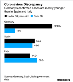
|
|
|
| (yes, we
need a better source for this statistics than this image) |
|
| We would
assume that Spain and Italy should have an 80:20 distribution as well - if
just enough people were tested |
|
| Or the
other way round: we assume that a minimum amount of round about +150% cases
are diagnosed in Germany (and in younger people alone) that are not even
tested in Italy or Spain |
|
| (the ~
50:50 distribution of Italy and Spain find itself in a ~20:20 distribution in
Germany, and then you have another 60% (which is 150% more that 40%)) |
|
| And this
even could be higher - you would guess there was also a higher number of
tested older people. But we don't know so we go for the minimum. |
|
| So the
factor for 'minimum real cases' derived from this for Italy and Spain would
be at least 2.5. This is a careful low value. |
|
| -> Don't forget that the Germany number of
'confirmed cases' is probably still far away from the real number of cases
(symptomitic) and infections (symptomatic and asymptomatic) themselves! |
|
|
|
|
|
|
|
|
|
|
|
|
|
|
|
|
|
|
| However I
discarded this projection, because it isn't flexible for different countries
because I do not have the data, so the projections are not valid for
countries who do test like Germany. |
|
| Also the
contexts of testing have changed over time in every country, so that this
data is indispensable to make this projection valid |
|
|
|
| not
implemented: |
|
| another way
of projection of real cases (or maybe infections or a value in between) is to
take a countries testing of health care personnel in relation to the ordinary
patients. |
|
| if it is a
projection of infections or real cases (or a value in between) depends on the
actual scenario of testingof the healthcare workers |
|
| in wikipedia
I found the following snippet for Spain: |
|
| 'According
to Fernando Simón, only 8.8% of diagnosed healthcare workers require
hospitalization, in contrast to 40% of other cases of the disease. ' |
|
| the
idea now would be that this gap is caused at large part by the gap in testing
between the two groups and that the number |
|
| from
this relation and the number of official cases we could project a number that
is likely somewhere closer to the number of real cases/infections |
|
| I
have neither researched this for other countries nor implemented it for Spain
yet. |
|
|
|
| In the end
you will have a bunch of projections that should give you at least an
interval of cases that is closer to reality than official numbers. |
|
|
|
| Another
way is combining several ideas and building an average index value. But be
careful, you still have to consider an interval around it as it is still the
same projections and it only tricks you into simplifying without
justification. |
|
| Very
important is also that because of the difference in data between countries
projections that might be to high here might be too low there. |
|
|
| infections |
|
|
|
|
|
|
|
| Distinguishing
between 'real cases' and 'infectons' is a bit odd, there is no clear border.
It historically stems from the beginning of testing where usually only
symptomatic cases were tested. Consider that this monitor already exists
since early March. So somethings may need a redesign. |
|
| Intuitively
'cases' comprise people who develop symptoms and so more or less suffer from
desaese. |
|
| Meanwhile
projection for infections try to estimate how many have been infected,
including also the ones who show no symptoms at all. |
|
|
| - a simple
idea is to use an assumed value for undetected infections (no or low
symptoms) and multiply the number of (projected) cases with that |
|
| downside:
this factor is varying a lot between countries and withi country data,
depending on the how much the country is testing and how much testing was
improved. so the accuracy might bounce a lot. |
|
| I tried to
account for that by using the case projections described above, using a
little different multiplicators to compensate for assumed method difference |
|
|
| - one idea
is to estimate the number of real cases and/or infections by projecting them
from the fatality rate |
|
| this has be
done just recently by a study of Imperial college and I will use the numbers
for comparison here |
|
| link to the
study:
https://www.imperial.ac.uk/media/imperial-college/medicine/sph/ide/gida-fellowships/Imperial-College-COVID19-Europe-estimates-and-NPI-impact-30-03-2020.pdf |
|
| downsides:
the fatality numbers are higly flawed as well. I will go to that in detail
further below |
|
| I have
applied a projection that is derived from those estimations from the study.
See the charts on the country sheets. |
|
| This method
is only applied to some of them, the ones mentioned in the study. |
|
| For the
other countries a lower quality secondary projection could be made, however.
By using the resulting factor (projection to cases) from the countries
present in the study and applying it to the non present countries/regions. |
|
|
| not
implemented: |
|
| Another way
of projection of real cases (or maybe infections or a value in between) is to
take a countries testing of health care personnel in relation to the ordinary
patients. |
|
| If it is a
projection of infections or real cases (or a value in between) depends on the
actual scenario of testingof the healthcare workers |
|
| (see
explanation above for real cases) |
|
|
|
| fatalities |
|
|
|
|
|
|
|
|
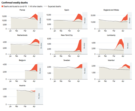
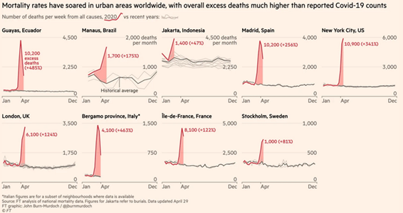
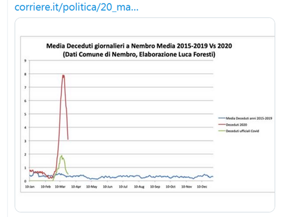
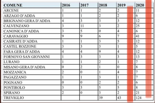
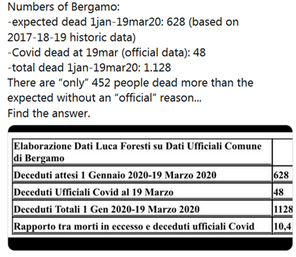
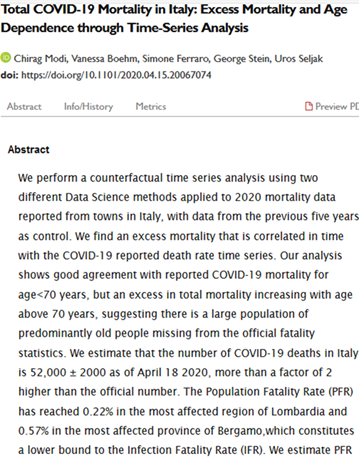
| critical
cases and fatalities have seen huge spikes in hot spots of the crisis. |
|
| communities
have started to compare the numbers with the annual averages and found that a
huge share (50-90% in the example cases below) of the excess numbers are
unexplained. |
|
| meanwhile
news outlets like NYT, Economist, and FT have build special monitors for
so-called 'excess data', that appears to be the most precise detector for the
real number of Covid19 fatalities. |
|
| (from there
it might be even a good way back to estimate the true course of the infection
curve once the studies on mortality settle more on similar values) |
|
| (At the
moment they still have erratic variances so that the old estimates from China
appear still the most plausible, a minimum of 0.5% in managed situations, can
rise up to 5% in crisis hot spots) |
|
|
| new
ressources from April: |
|
|
| monitoring: |
|
|
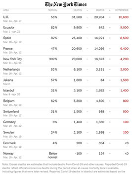
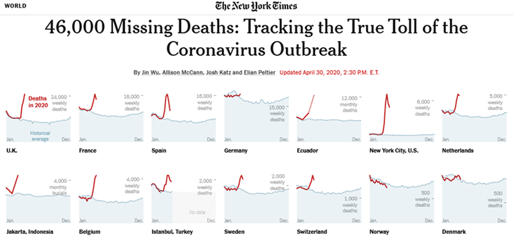
| NYT |
|
| https://www.nytimes.com/interactive/2020/04/21/world/coronavirus-missing-deaths.html |
|
|
|
|
|
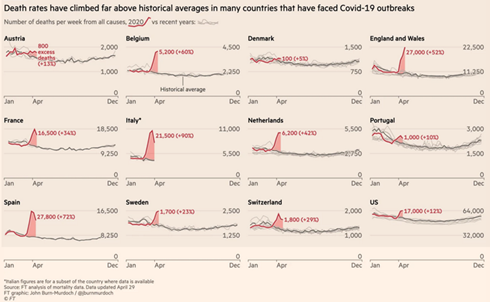
| Economist |
|
| https://www.economist.com/graphic-detail/2020/04/16/tracking-covid-19-excess-deaths-across-countries |
|
|
|
|
| FT |
|
| https://www.ft.com/coronavirus-latest |
|
|
|
|
|
|
|
|
|
|
|
|
|
|
|
|
|
|
|
|
|
|
|
|
|
|
|
|
|
|
|
|
|
|
|
| older
ressources from March: |
|
|
| see |
|
| https://elpais.com/sociedad/2020-03-27/el-coronavirus-causa-mas-muertes-de-las-detectadas.html |
|
|
|
|
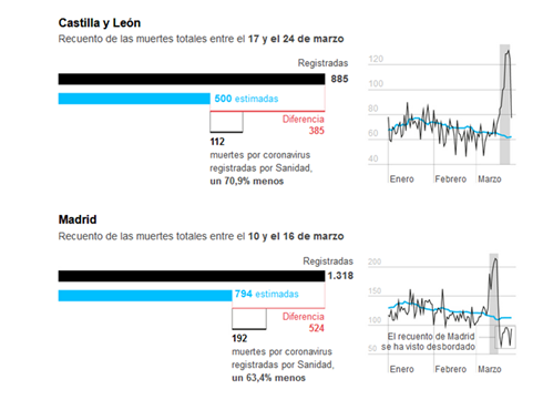
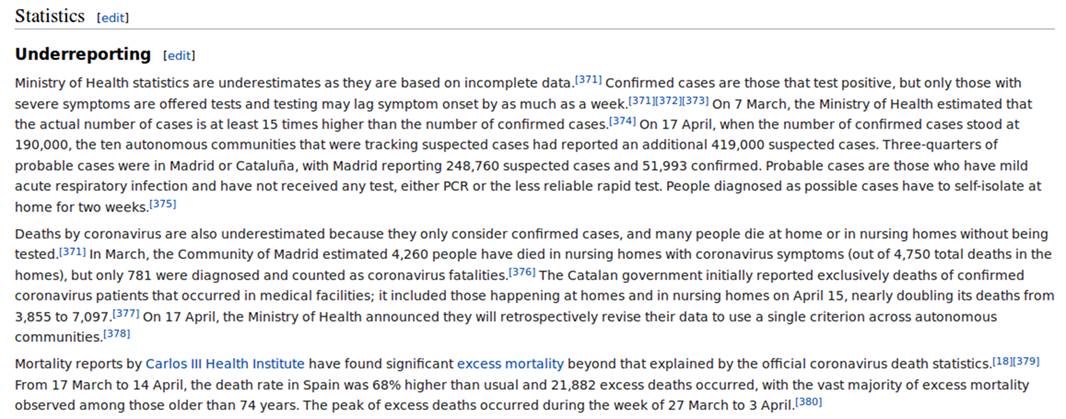
| see also
this snippet from wikipedia for Spain |
|
| https://en.wikipedia.org/wiki/2020_Spain_coronavirus_quarantine#Underreporting |
|
|
|
|
| see Italian
sources |
|
|
|
|
|
|
|
|
|
|
| a US study: |
|
|
|
|
| However,
trying to add more of the undetected cases to the official data causes
another problem of inconsistency in the timelines. This has already been
adressed at other places in this document. |
|
| Here only
fatalities in hospitals had been counted. April 2 they appended data from
other sources, although apparently not in a clean daily rhythm, which lead to
artefacts on the timeline. |
|
|
| immunity |
|
|
|
|
|
|
|
| So the
'real' numbers of infections are higher. Are places closer to collective
('herd') immunity? |
|
| This can
not be generally answered. The projections are made for countries which in
most of the cases have intervented after having regional crisis clusters vs.
other clusters with relatively low infection rates. |
|
| So at this
point the answer that countrywide projections deliver are insufficient. |
|
| I recommend
to play a little with the experimentation panel to understand the mechanics
of clustered scenarios. |
|
| http://fuff.org/data/cr0.html |
|
|
|
|
|
|
|
|
|
|
|
|
|
|
|
|
|
|
|
|
|
|
|
|
|
|
|
|
|
|
|
|
|
|
|
|